Monday, November 14, 2011

Anthropometrics


(click image to see in entirety) 


I chose to measure myself and my boyfriend, Michael for this exercise in ergonomics. I found that for each of us, our wingspan was almost equal length to our heights. There were not many similarities between our measurements to one another. He is 6’3” and I am 5’6”. This made for drastic differences in our measurements. With that said this made me consider how I would design for two individuals with heights that are dramatically different. For one, the heights of cabinets, counter tops, sinks, the arms on chairs, tables, and shower walls/shower heads would have to be taken into serious consideration. All of these items would have to be to at such a height that both people could use them comfortably. I believe most of these would have to be adjustable (shower head, cutting surfaces, etc…).  In his current home he has to bend his head to an uncomfortable degree just to be able to wash his hair. As designers we need to design these elements to suit the needs of our clients and not depend on industry standards to determine what we place in homes and commercial buildings. It is our job to consider humans, and that means in totality (height, weight, shape, disabilities, likes and dislikes, etc…).

Wednesday, October 26, 2011

Thursday, October 20, 2011

Wednesday, October 12, 2011

Vanstory Lighting Company Field Trip

After visiting the Vanstory Lighting Company I came away having learned a tremendous amount about the differences between the use of LED lights and Fluorescent. I found it interesting that based on the markets now (at a commercial level) it almost as cost efficient to use LED lighting as compared to Fluorescent. I was also surprised at the amount of options of light fixtures that are available with a LED lamp. I went into the field trip expecting LED lights to be dimmer and more incandescent than Fluorescent. I was pleasantly surprised that they produce a similar amount of light, and yet their lifespan is much greater, and they are a greener product.

Light Sketch Series 4

Freight Elevator
IARC Library


Small Elevator
(image finished and waiting to be downloaded)
Freight Elevator:
1.
a)    Down Light
b)   Recessed
c)    2 Luminaries, 4 lamps, CFL, CRI 62, CCT 4200 lamp life >8000 hours
d)   Bi pin base
e)    Sylvania osram
f)     Lumens=135      Lighting Distribution= 2x8
g)    Brushed aluminum casing with acrylic filter
h)   Diffused acrylic
i)     Fixed
j)     2 Ballasts
k)    Elevator- dry
l)     N/A no louvers or baffles

2.

a)    Vertical Circulation
b)   Ambient
c)    Luminaries relies on refraction of metallic surfaces
d)   Change filter to baffle system in order to diffuse the light

IARC Library:
1.
a)    Down light
b)   Suspended
c)    16 Luminaries, 32 lamps, CFL, CRI 62, CCT 4200 lamp life >8000 hours
d)   Bi pin base
e)    Sylvania osram
f)     Lumens=135      Lighting Distribution= 2x8
g)    Aluminum casing
h)   Diffused acrylic
i)     Fixed
j)     2 Ballasts
k)    Dry
l)     Baffle
2.
a)    Reading/research
b)   Ambient/ task
c)    Casts light downwards + upwards – washes the room
d)   Provide different luminaries to allow for reading and other activities

Elevator (Smaller one)
1.
a)    Down light
b)   Recessed
c)    Incandescent 2500 hours, 36 luminaries, 36 lamps
d)   Single contact medium screw
e)    Phillips Lighting
f)     Lumens – 935, light distribution – wide beam
g)    Aluminum casing
h)   Glass
i)     Fixed
j)     None
k)    Dry
l)     N/A

2.
a)    Vertical circulation
b)   Ambient
c)    Produces warm light that reflects off metallic walls
d)   Brighten the space, and add lights that provide more luminance. Currently the space is too dim.


Wednesday, September 28, 2011

Light Series 2 and 3


Metamerism


A)   Studio Space.
B)   The purpose of the lighting is a sparkle light that directs light into specific areas.
C)   LED.
D)   The LED gives off a cool light form.
E)   Creates an enchanting atmosphere because of the pattern and rhythm the light can create.
F)    This light does not work well in the studio space because there is too much competing light sources within the space.

A)   Material (IARC) library.
B)   The purpose if the lighting is to provide consistent lighting throughout the space, which is considered ambient.
C)   Fluorescent.
D)   The fluorescent light gives off a warm hue that is visually pink.
E)   The warmth of the fluorescent light creates a relaxing environment.
F)    Yes, it does work well, although it is lit in pockets. It would be good to have spot lighting in specific areas, which would provide better lighting for reading.

A)   Walkway of third year studio.
B)   The purpose of this lighting is to provide a spotlight for pin up spaces.
C)   Multi reflector.
D)   The multi reflector lamp gives off a warm spot of light.
E)   The warmth of the light creates a cozy feeling.
F)    It does not work well because the range of the spot of light is not large enough for the average presentation board. The light projected is irregular.

A)   Studio space.
B)   The purpose of this light is to provide task lighting when working at ones desk.
C)   Incandescent.
D)   The incandescent lamp gives off a warm light.
E)   This warm task light tends to create an environment of tension and anxiety.
F)    It does work well because it serves it purpose as a task light by not flooding into adjacent areas.


Wednesday, September 14, 2011

Thursday, September 1, 2011

Tuesday, August 30, 2011

Light Revealing Experience


 Alyssa Hankus
08-30-11

The article discussed a multitude of ways light affects us, and the environments we inhabit. Among the ways listed were nature, climate, and light and time vs. light and task. While discussing the nature aspect it was broken down into several variables in how people approached or reacted to their individual climates.  In Japan they experience extreme weather during their summer and winter months from extreme heat during their summer and snow during their winters. They designed their dwellings to open up during the summers to allow for cross breezes to cool their space, and incorporated heated pools and fire pits to warm them when the winters became harsh. The article also spoke about the harsh light in Italy; and how the Italians modified their windows and their window treatments to embrace/celebrate the light; yet lessen the strength of its rays entering into their homes.
“Our perception of light-quality is intertwined both with our response to the local climate as well as with the task at hand” (Light Revealing Architecture, p. 12). In regard to light and time or light and task examples were given about Frank Lloyd Wright’s studios, and workspaces.  FLW designed the studio spaces and libraries to have ample lighting as part of the overall design. It wasn’t exactly ingenuitive, the thought for needing natural light, but it was the way he approached it that was. The design itself revolved around the need for light, and human interaction with the space. The design took time of day into consideration as well, and what type of light would be useful to the occupants.
“… light…can make buildings be places that have special meaning for us, extending their value beyond mere functional use” (Light Revealing Architecture, p. 6).  The article went into great depth to establish that we each as individuals experience and appreciate light in various ways based on several factors…upbringing, climate, exposure, geographical location, culture, etc… With that said I experience and view light much differently than maybe even my neighbor. Even growing up in the same geographical location our experiences have changed the way we view light. That could be a vacation, a grandparent that may live in another part of the country that we may have spent our summers with, or several other reasons.
Personally I have grown up in a home that does not have a lot of sunlight coming into the space.  Now that I am on my own I tend to keep the curtains pulled closed in my apartment. Given that I am from Maryland originally our sunlight is not quite as harsh as the North Carolina sun, and I am not used to its intensity. Light also effects us at night. I grew up in a suburban neighborhood with only one or two street lamps to light the street, and now living in a city area with the lights shining 24/7 whether they are natural or artificial it feels like a constant bombardment of light. I have had serious difficulty sleeping for that reason. I have had to black out the windows at night so as not to be disturbed.  With that said my roommate prefers to have the shades open and light pouring into the space. She grew up in North Carolina and used to it. To me, it does not only bother me visually but it also elevates the temperature. This is also something I am not used to. I prefer to be cooler.
As fall approaches I am also reminded of our climate differences. After experiencing North Carolina autumns for the past couple of years I have noticed that the leaves are not as vibrant, and do not vary in colors as in Maryland. With colder temperatures, and with sunlight not being as harsh the leaves turn sooner, and are deeper, more vibrant shades. I believe the colors we see in nature are connected to the light experienced in those climates and directly corresponds to how to alter our spaces.
On the topic of task, I know that in our studio space or example, light is a serious issue both during day and night hours. During the daylight hours light streams from all areas except for the 4th floor. It is bright, and at times too bright where we are forced to draw the shades. At night there is not adequate lighting for us to complete our work easily, and we as students have had to purchase our own individual lights to accommodate for this. We are mostly relying on natural light inside of the studio vs. artificial. There are both positive things and drawbacks to this as previously stated.
It has been an eye-opening experience, having read this article. I did not previously think about how we experience light so differently as individuals than others, and what factors into these differences.

Light and Health

Alyssa Hankus
08-30-11


Being a cancer survivor this is not the first time my attention has been drawn to the relationship between light and wellbeing. Often times when needing to heal and recover I needed darkness in my room to allow for sleep. This is exceptionally difficult to achieve in hospitals. Light leaks from everywhere. It is not the natural light, however, that is the problem, it is the artificial. It leaks from under the door cracks, the emergency lights, and lights used for way finding once the sun sets. However, natural light had a huge impact on how I would feel each day. Should I feel just well enough to sit up and be by a window my mood, and my health would be tremendously better. So I can relate to the article when it spoke about circadian rhythm.
I found it interesting when the article spoke about prolonged exposure to artificial light, or irregular lighting and the effects it would have on the human body, or SAD (seasonal affective disorder). Many times I do not think that we, even as designers take into account the effect of the lighting we place into spaces in the sense of health risks. The fact that nurses are having higher occurrences of cancer when working the night shift is alarming. Honestly, I would never have thought to study that prior.
I also found it interesting when the reading spoke about the differences in our productivity, and our ability to function as compared to daylight savings time. It makes sense that our bodies would function and changed based on the cycle of the sun vs. manmade hours. I question if we would be healthier if we simply went by the sun’s cycle vs. modifying the hourly system.
These articles have certainly raised questions, and were thought provoking. I would be curious to do more research on the matter.

Thursday, April 28, 2011

Wednesday, April 27, 2011

wi10

My goals at the beginning of the semester were to think outside the box vs. being too literal, to be more confident in my ideas as a designer, to explore different approaches to the design process, and figure out which style is best for me, and to become familiar with other designer’s work to expand on ideas, ways of thinking, and understanding. I feel like I have done well to think outside of the box, and to expand upon my ideas. I also feel as though I have found the design technique that works for me, which is to first go to my sketchbook and draw out my ideas as well as to jot down ideas that tie into my drawings. I have not become as familiar with other designer’s work as I had hoped I would at the beginning of the semester. Instead I have relied more on what is within me. I would like to take the opportunity over the summer to emerge myself in famous designer’s work, and some not so famous.
            I have learned a lot about myself this semester in the way I design, the way I work with others, and about allowing my design voice to shine through.  I found that in working individually my work was not as strong as when I had peers to enhance the projects. They were able to fill in the gaps where I was not as strong, and vice versa.  I do feel that working at a smaller scale (groups of 3 or 6) my design voice was stronger than at a larger scale. Once we moved into a group of 12 it became more difficult to maintain our individual design voices.  While we were able to incorporate our original 12 concept words, and make sure that each were represented in the over all design, when it came down the details it became more of a challenge for each of us to have a say so in what the designs would look like. This was no because we were not being vocal, but because each of us has such strong opinions we were not able to appease everyone, and therefore compromises were made.
            I would say even though writing has been a key component to our design process this semester from the very beginning, it was not until the end of this semester that I found it to be the most helpful. During the first few projects we concentrated on narrative writing, and to me that was not as useful as informative writing. To me writing is more imperative when it is time to refine my work, and not as much when originating ideas.  However, writing is useful at every stage, I just believe it comes in different forms for each of us. For me at the beginning stage I tend to write concept words, and ideas of how things can work together. I would like to say that narrative writing did allow me to focus on what it would be like to inhabit the space, and what the transition would be like from room-to-room. Without that writing component I did not put myself into the client’s shoes quite as much.
            The original strengths I listed in wi1 were that I am detail oriented, dedicated, inquisitive and enjoy exploring various avenues, that I have interest in several areas that can be combined into my designs, that I am adventurous and willing to take on new challenges, and that I also listed my photography skill set. I still believe that these are my strong suits. I would add finding inspiration to my list. After Patrick and Claire selected Blakeni and I to speak on inspiration a few weeks ago I realized how accurate they were in selecting us. Initially when I saw my name under that category I questioned their reasoning, I did not at that time I feel that it was accurate. However, after brainstorming and going through my design process, and how I come up with my idea I realized that it is definitely I skill set I possess, and something I show strength in. I can now also add computer programs such as illustrator and photoshop to my list of skills. After an intense semester I have had to embrace computer programs to further enhance and progress my designs. I have largely relied on these programs, and now feel more comfortable with using them, whereas before I was only familiar with hand drawn and acad drawings and renderings.


             The images below are from jenga 1.0, 4.0, and 7.0. The first image is one of my first boards, the second is from our second round as a group of 3, and the third is my individual board from the last project. You can see the progression from my first board, to having it be a group collaboration, to taking what I have learned from my peers and applying it. I recognize that we are always learning, always evolving, and we can always grow when encouraged by our peers. I feel this semester has been a huge success in shaping us as designers, and allowed us to learn from our peers and strengthen our work that much more. For the first time I feel we truly recognize in ourselves what we both possess and lack, and whom we can go to, to fill in the gaps.


1st yr Crits

Today we, as second years, had the pleasure of attending the first year's final critiques. It was both interesting, and surreal. I remember very clearly being in their position last year, and how nervous I was.

Overall I was pleased with what I saw, and am excited to see what they produce in the future. I was asked to critique one student, and I chose to critique Kristy Stroud. She did an excellent job in her presentation. She spoke clearly, her boards demonstrated her concepts well, and she went above and beyond what was required of her. During her presentation she used her deliverables well. By walking us through the model she constructed we, as the audience, were able to get a better sense of what the space would be like to inhabit.

I would offer a few suggestions moving forward though... Her perspectives, while well drawn and rendered, deserve to be showcased and should be larger when presenting. I would also suggest that she use lighter colors when rendering. It was difficult to see the details, and read them from far away. She has a good technique when rendering, and it would not be difficult to make these minor adjustments, and make her work that much more powerful.

I would also suggest that the documents be mounted to make them pop out, and be the showcase of her presentation. After putting in such long hours into designing, you should pay special attention to how you will be delivering them.

Also, it was noticeable that during the presentation she covered her drawings while displaying her model. She held it directly in front of her drawings while she walked us through the model. It would be a better usage to go back and forth between the model and the drawings so that the audience can get the entire experience.

I would like to commend her on a job well done. It is difficult to stand in front of a large crowd and present and defend your work. She did an excellent job, with minor issues, that can be easily fixed in the next presentation.

Congratulations, Kristy, on the completion of first year, and good luck as a second year! You'll do great!

Wednesday, April 20, 2011

Friday, April 15, 2011

Top 10 list...

1.Include some type of visual aid or graphics
2.Simple (remember this is not an elaborate drawing)
3.Score materials at connection points whenever possible so materials will be integrated into design and connected using less work. Practice first to see how many passes of knife using normal pressure will cut through a sample of material and use a guide for scoring. Keep in mind the sharpness of the blade.
4. Be rested. It enhances clarity.
5. Don’t mention what you don’t know.
6. Stay in the same tense throughout.
7. Write as your project is progressing. Don’t leave it until the end.
8. Create an order to your presentation- tell a story.
9. Overlap materials at connection points for gluing, taking into account the thickness of the material and frame. Hold elements together until glue takes hold and place at correct angle to set. Use triangle edge to reinforce placement of elements when gluing at 90 degrees.
10. Give purpose to all of the graphics.

Thursday, April 14, 2011

Inspiration

Patrick (my studio professor) paired us in groups of two and had each group give a 10 minute speech to the class in the areas we excel in. My partner, Blakeni, and I were paired together to speak about inspiration. Below is our top ten list. (I illustrated the evens, she illustrated the odds)


We also had another 10 that didn't make the list...

-       furniture
-       abstract art
-       mechanics
-       fashion/clothing/jewelry
-       reading
-       blogs
-       google
-       cooking
-       traveling
-       dreams

Wednesday, April 13, 2011

wi9


 Upon merging with Symbiosis we maintained the idea of incorporating our original concept words that we relied largely upon when we designed our previous structure, Pinnacle. My original word was Epiphany, and has shown a prominent voice within the design. In Jenga 5.0 and 6.0 we arrived at the concept of Pinnacle based on my original word. The Pinnacle was the final experience that illuminates the sky, and provides a moment of clarity.
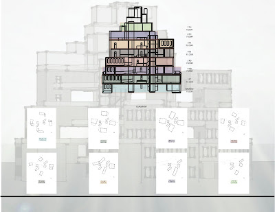
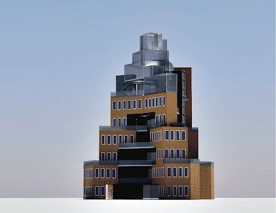
Moving forward we carried this idea into our new structure “Synergy.” Visually as you move your eye from the ground level to the top you see a progression building up. Each moment as you move upwards builds upon the previous striking a desire within to reach that final moment, that final experience, the Epiphany.
You also see a correlation between the new structure and the way I utilized my kit of parts in Jenga 1.0 and 2.0. As you enter the space my kits of parts (three solids) obstructs your view of the rest of the unit. However, as you proceed, information in unveiled as you turn each corner. Once you reach the stairs and begin your way upward, you ultimately reach your moment of unveiling and epiphany. Each solid creates a similar experience of epiphany. As you transition within the space you alternate between a lack of information and having full disclosure, each solid having a purpose hidden within. This concept is furthered through the finishes. As you enter into the space there are dark finishes on the floors and walls, and as you reach the top level the finishes get lighter; the solids remain in white. This continues to give you the experience of traveling from darkness into light, providing you with a complete experience.
            Similarly, our new structure goes back and forth between having information about the over all space be at your disposal and having your line of sight be obstructed, as the rest of the building remains a mystery. As you continue your journey to the top more information is revealed until you reach your final destination, the observation deck. This further utilizes my original word by broadening your view of the city of Vic. Sitting high upon the hill you are able to survey everything below, no longer having your view obstructed, no longer having lingering questions.
            I find it to be a huge accomplishment to have maintained our original 12 words, and for each to have a strong presence in the final 18 story structure. Our original words were twist, tilt, revolve, reverberate, protrude, edge, leap, clockwork, spark, beehive, ignite, and epiphany. Each can be seen in one form or another. The building twists in a clockwork motion, and revolves, reverberates, and protrudes over the edges. As you leap from floor to floor epiphanies are unveiled. Interest is ignited, and sparks of intrigue keep you making your way to the peak. Items are tilted in various angles, and the overall structure goes from a wide base to a narrow top resembling a beehive. It was with great attention to detail, and strong design voices that we were able to accomplish this goal.

Sunday, April 3, 2011

Jenga 7.1


When meeting over the weekend with Symbiosis we discovered a similar design language of angles, and an atrium effect in the center of our structures.
Together we formed Sinergia, Spanish for synergy: “the interaction or cooperation of two or more organizations, substances, or other agents to produce a combined effect greater than the sum of their separate effects”.  We have decided as a group to relocate just north of Vic, Spain near the reservoir in Vilanova de Sau up in the hillside above overlooking the water.
Together we have axial navigation, and a stacking of our buildings. We have chosen to separate out original structures and combine them in a new way to better relate to both of our original concepts coming out of Jenga 6.0. We are focusing on voids and solids, taking that concept from the surrounding area where there are areas of openness and areas that are more closed off as you reach the mountain regions. As we move into Jenga 7.0 our focus is on materials native to our destination in Spain, as well how our structure interacts with the land, and its surroundings including other structures in the area.  We are considering materials such as crema marfil, tungsten, zinc, quartz, and copper (all native materials) for our structure.

http://en.wikipedia.org/wiki/Vilanova_de_Sau
http://www.yankodesign.com/2007/05/09/tetris-furniture-by-nendo/

Voids and Solids


Friday, April 1, 2011

Saturday, March 26, 2011

Here, there, and ELSEWHERE

I went downtown yesterday to my favorite place Elsewhere, and took a few pictures. They just opened up again a few days ago after a few months of reorganizing, and reinventing. I always find inspiration, and intrigue there. I hope you enjoy the photos. 


Friday, March 25, 2011

Wednesday, March 16, 2011

5.0 Charrette Reflection


I took part in my first charrette on Monday. We were instructed to do two, one-hour charrettes with two teams of three. Our first team was “interlocking.” We found that we quickly were able to formulate design ideas, and our individual concepts were compatible with theirs. We quickly realized each other’s strengths and assigned the tasks accordingly.  Never having taken part in a charrette before I found the process invigorating. It forced us to commit to an idea and move forward quickly, whereas the typical design process may take up to a few days. I was surprised at our success, and the ideas that came to the table so quickly with our first group. The second group we worked with was “beaucoup.” I did not feel that we were able to combine our structures as cohesively as with the previous group. However, we did quickly formulate ideas, and produce what was expected within the hour’s time. We formed what would be “straight curves” should our new design be chosen and we move forward. I feel, however, that in moving forward the design we had with “interlocking,” now “pinnacle” would be a stronger design. We each had some form of forced navigation, and obstacles that you must go around to find your destinations. Together we formed a pyramid-like structure where you reach your “epiphany” (my original word) in the final stage of your journey. It was an intriguing, and interesting design, one I hope to move forward with, and explore. With “beaucoup” and “straight curves” our structures have very distinct and different design languages. Their original structures embody curvilinear lines, and waves, whereas ours is about right angles, and geometric shapes that encompass the necessities for living in these units, such as the bedrooms, kitchens, baths, etc…  Overall I would be most pleased to work with “interlocking,” as I feel we will be able to accomplish whatever tasks are put before us the most successfully. 

Friday, March 4, 2011